
|
Cancer proceeds through two phases, compensated, when the tumor does
not cause any damage or distress, and de-compensated, when the patient suffers.
The following analysis implements the conclusions of the previous epidemiological
studies:
1. Breast cancer survival curves indicate that that the organism depends
on the tumor. Tumor ablation in compensated cancers
is followed by a rising hazard rate .. In de-compensated or metastatic
cancers the patient suffers mainly from the damage caused by the tumor which
is generally alleviated with chemotherapy.
2. This phenomenon is observed also in other cancers where it is more
pronounced in compensated cancers and less in de-compensated cancers
3. The third analysis demonstrated that in advanced
age cancer progression is slower than in young patients
The graphs below depict age adjusted incidence and mortality of breast cancer
in the period of 1973 -2002
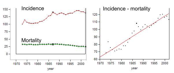 |
For years, age adjusted breast cancer incidence was relatively
low and started rising during the last three decades. It might appear as if
breast cancer became more aggressive. However since age adjusted mortality
actually declined this conclusion is wrong. The rising incidence was driven
by new means to detect cancer like mammography. Since breast cancer was
detected earlier, and mortality did not rise, patients lived longer. The
rising incidence does not indicate a change in cancer biology and this phenomenon
is known as lead time bias.
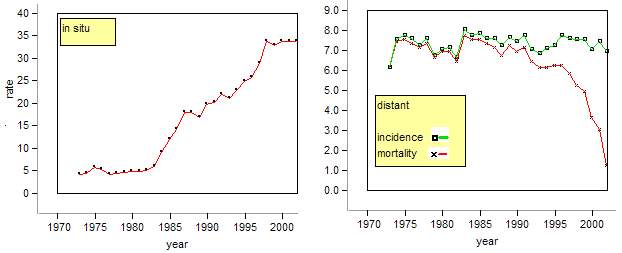
The figure below on the left depicts age adjusted incidence of in situ carcinoma.
Its rise indicates that more and more compensated cancers were detected. The
right figure depicts age adjusted rates of distant cancer. While the age adjusted
incidence remained virtually constant, mortality declined which is attributed
to an improvement in chemotherapy.
 |
Since patients lived longer with their cancer its prevalence rose as well. The scheme below depicts the relationship between the two rates in a population. When incidence exceeds mortality prevalence rises and vice versa.
 |
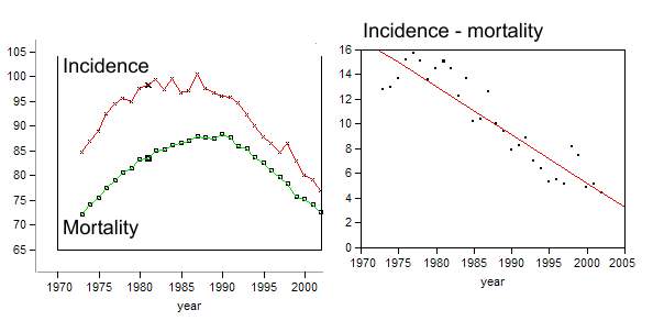
The distance between the two curves is proportional to prevalence, and the above difference curve indicates that breast cancer prevalence rose. In male lung cancer patients this pattern is different. Initially both rates rose and from 1990 they declined. This pattern is attributed to smoking habits. The decline started when many males quit smoking.
 |
Pancreatic cancer is extremely aggressive as evident from the short distance between the two curves.
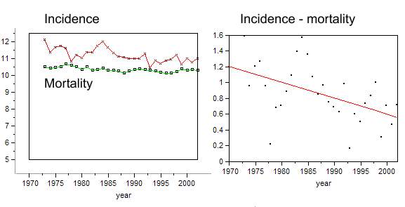 |
The distance between the adjusted incidence and mortality
indicates cancer aggression. The narrower the distance the more aggressive
the cancer.
It is striking that age adjusted mortality of most chronic cancers declines.
Like the breast cancer mortality presented above. The decline might indicate
that treatment became more effective. Particularly in de-compensated cancers.
However this decline results from yet another epidemiological bias. In advanced
age patients suffer from more than one disease. A patient dying from a stroke
may carry into his grave an undetected cancer. A rising stroke mortality
might therefore be accompanied by a declining cancer death rate. The curves
below depict age specific mortality rates of white residents in Connecticut
in the year 1998. (http://www.dph.state.ct.us/OPPE/Mortality/Age-specific/AGESPECwh.htm)
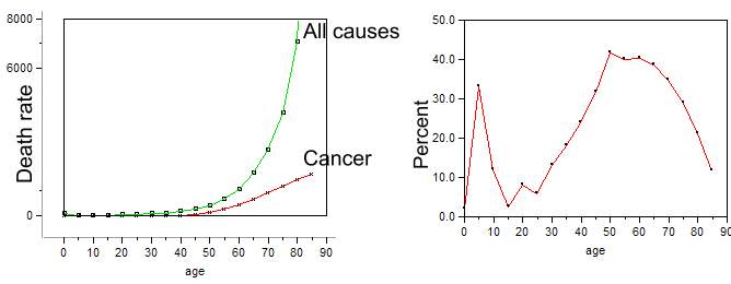 |
The right curve depicts cancer
death rate as percentage of all deaths (100*cancer/ all causes). The initial
peak indicates that childhood cancers are the main cause of childhood mortality.
From the age of 15y the curve rises reaching a maximum at the age of 50y
whereupon it declines. With advancing age cancer under-diagnosis bias rises
which explains the observed declining cancer rate.
There is yet another factor which might contribute to the decline of cancer
death rate. In advanced age cancer progression
is slower. Its prevalence rises and the age adjusted death rate declines.